
Overview
The Analytics page brings your performance data into a centralized, tab-based layout so you can see how your account is performing and trending over time, without navigating between scattered screens or asking for any manual data pull.
Key things the page gives you:
- A single Overview tab that summarizes every area of performance in one place
- Four dedicated category tabs for deeper detail:
- Visual trend components, including a bar chart for revenue over time and horizontal bar charts for completion funnels
- Clear unit indicators on every metric, so you always know whether a number is orders, reservations, hours, or currency
- Tooltips on each KPI explaining what is being measured
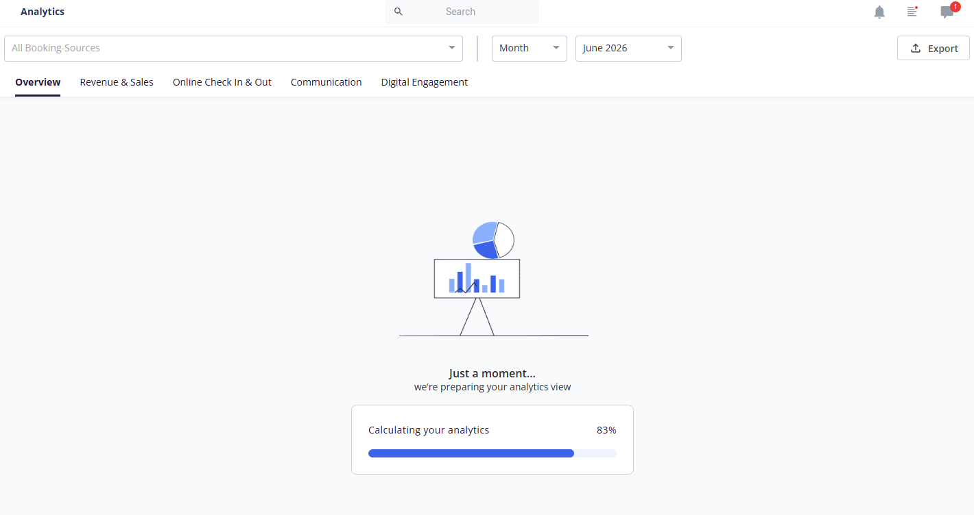
- A full-page loader with a progress bar when you open the page
Use cases
- View upsell revenue trends by month to instantly recognize performance drops or gains, then adjust pricing, timing, or messaging
- See all upsell KPIs (orders, revenue, conversion rate) in one centralized panel for a high-level view without moving between tabs
- Compare a custom date range with the two preceding periods of equal length to validate the impact of a campaign
- Review the online check-in completion funnel to find where guests drop off
- Check chat response times and AI coverage to assess communication performance
- Identify your most popular guest app posts and most scanned QR codes
- Reduce dependency on CSMs for custom data pulls, so support time goes to proactive work instead of reactive reporting
How to use it
Open the Analytics page
- Navigate to the Analytics screen. A full-page loader with a progress bar appears while the page loads.
- The loader is shown only when you land on the default Overview tab. Other tabs use the standard skeleton loaders.
- The progress bar advances according to the number of elements on the Overview screen, so it reflects real loading progress rather than a fixed timer.
1) Overview tab
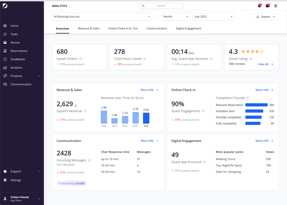
- Overview is selected by default and shows the consolidated dashboard.
- The tab strip includes: Overview, Revenue & Sales, Online Check In & Out, Communication, and Digital Engagement.
Read the Header KPIs
The Overview tab opens with four header KPIs, each calculated for the selected period:
- Upsell orders: the sum of all orders in the selected period
- Total Time Saved: The manual hours saved through Duve automation (check-in, messaging, etc.)
- AVG Guest App Sessions: Average in-app time guests spend per reservation across check-in, check-out, and guest-app browsing.
- Guest Rating, which includes a View All link that takes you to the Reviews screen
Each header KPI has a tooltip explaining what it measures.

Review the four Overview sections
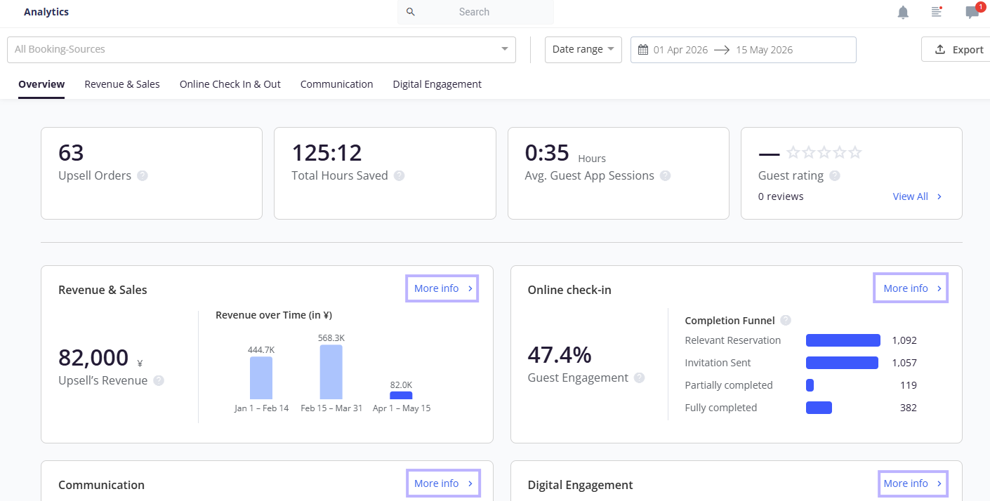
Below the header KPIs, the Overview tab groups your data into four cards:
- Revenue & Sales: upsell revenue with a change indicator, plus the Revenue over time bar chart
- Online Check In: guest engagement rate with a change indicator, plus the Completion Funnel horizontal bar chart covering reservations, invitations sent, partially completed, and fully completed
- Communication: incoming messages, shown with the number of messages, a "from X guests" line, and a change indicator, plus a chat response time breakdown listing response time alongside the number of messages. If your account or brand uses AI, a line on the card indicates that AI is operating.
- Digital Engagement: guest app entrances with a change indicator, plus your most popular posts and the number of views (clicks) each received
Use the Revenue over time chart
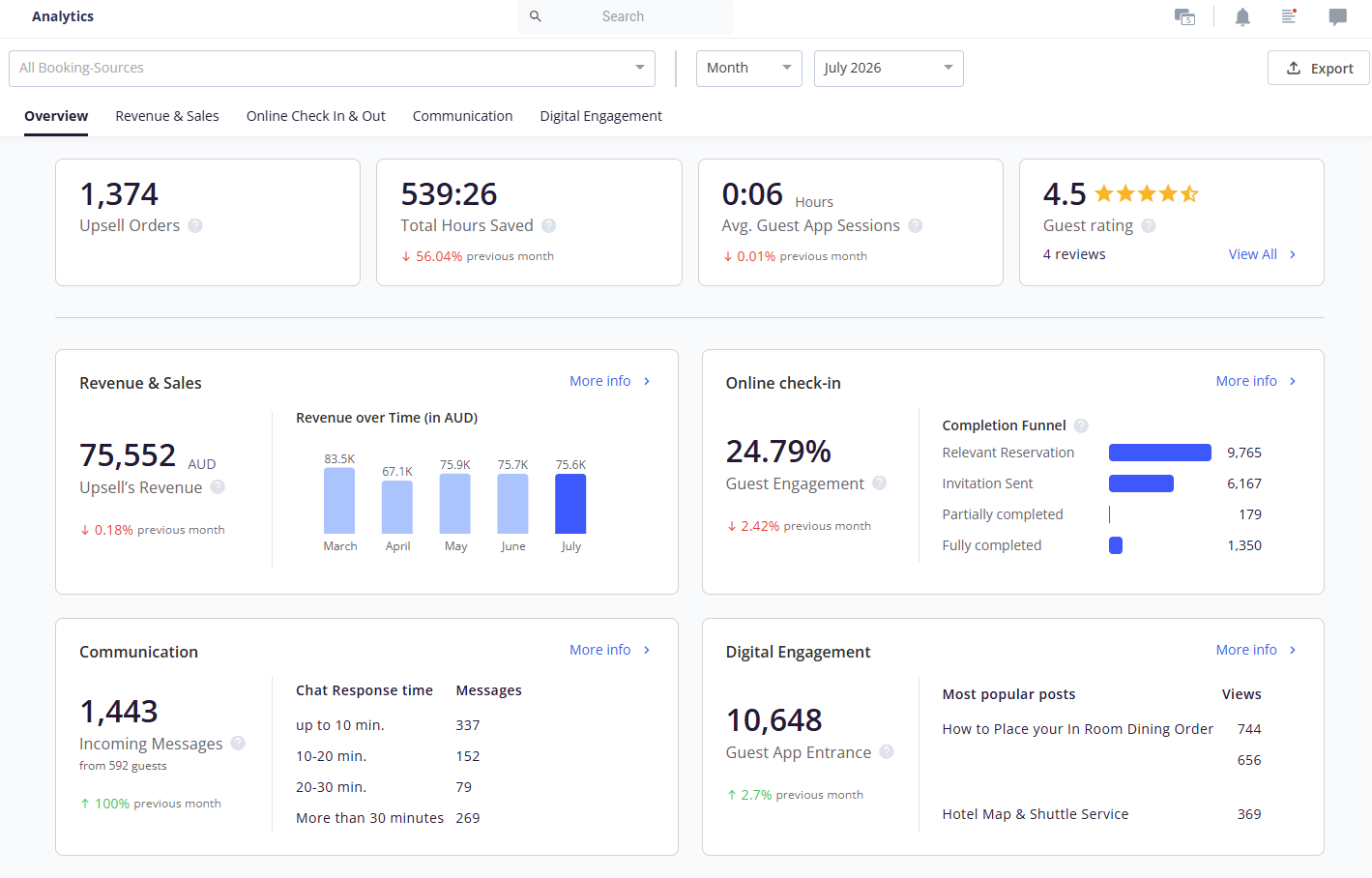
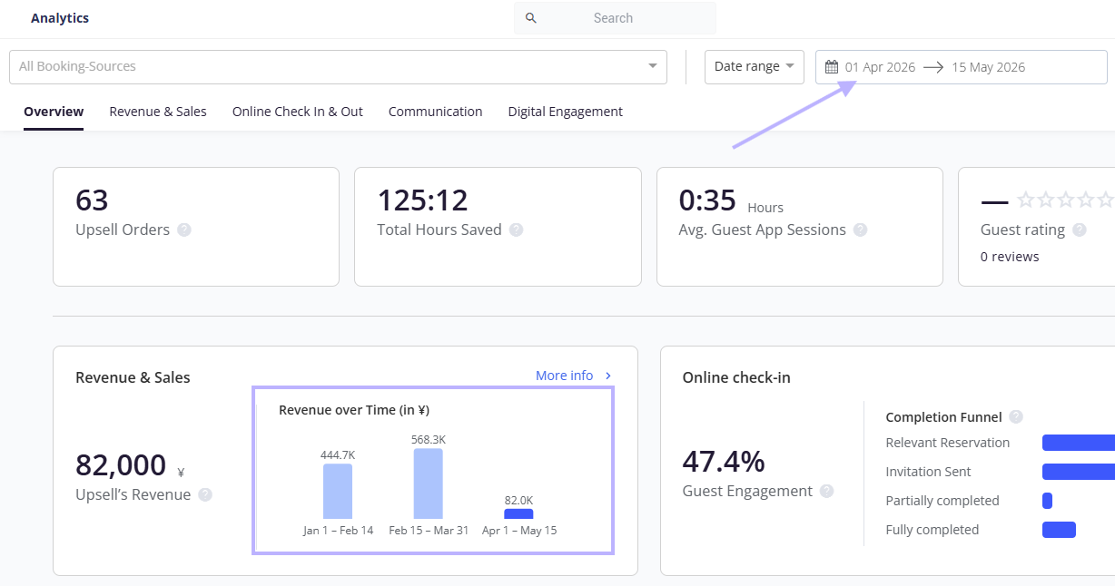
- The bar chart adjusts to your selected time period.
- Select a specific month to see that month plus the previous four months, for a total of five bars.
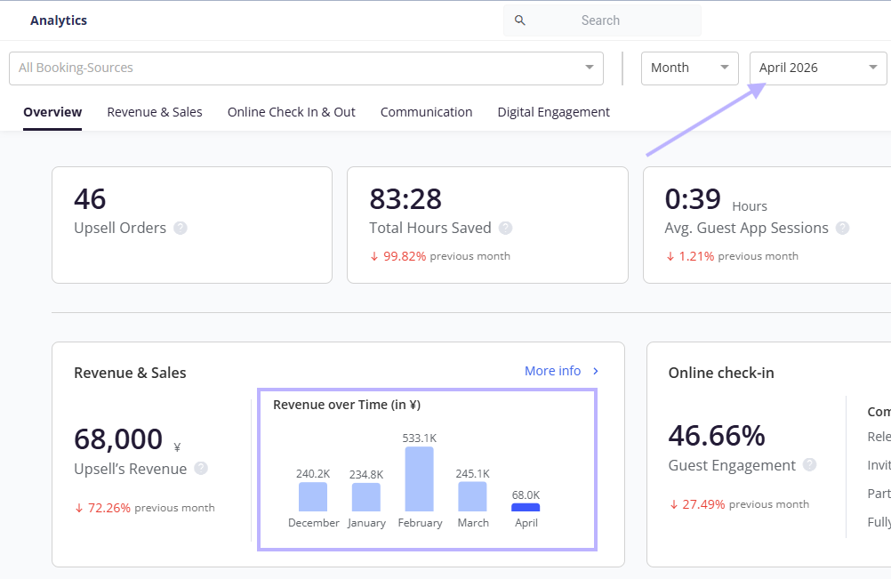
- Select a date range to see that range plus the two preceding ranges of equal length, for a total of three bars. For example, if you select April 1 to May 15 (44 days), the chart shows April 1 to May 15, February 15 to March 31, and January 1 to February 14.
Drill into a category with More info
- Each Overview card has a More info link that takes you to the matching tab.
- More info appears only on the Overview tab. The same card shown inside its own tab hides the link, because you are already there.
2) Explore the category tabs
You can reach each tab from the tab strip or from the matching More info link.
-
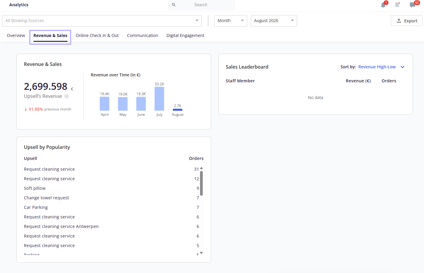
Revenue & Sales: Present the Revenue & Sales dashboard component
- Revenue & Sales: Presents the total revenue of upsells
- Upsell by Popularity: Presents what guests order most often, based on the selected time period
- Sales Leaderboard: Presents the Frontdesk Upsells leaderboard of each user's total upsell revenue and number of orders.
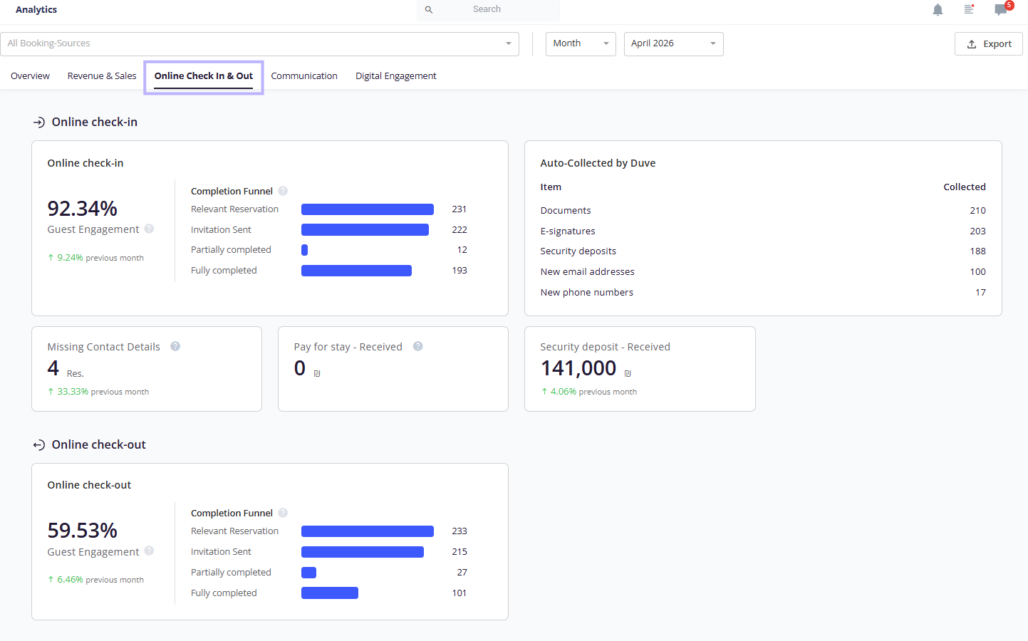
- Online Check In & Out: an Online Check In section (dashboard component with guest engagement with a change indicator, and a completion funnel, missing contact details, pay for stay received, Security deposit received and auto-collected by Duve - that presents all the statistics of information collected via the Pre Check-in) and an Online Check Out section (dashboard component with guest engagement with a change indicator, and a completion funnel covering check-outs, invitations sent, partially completed, and fully completed)
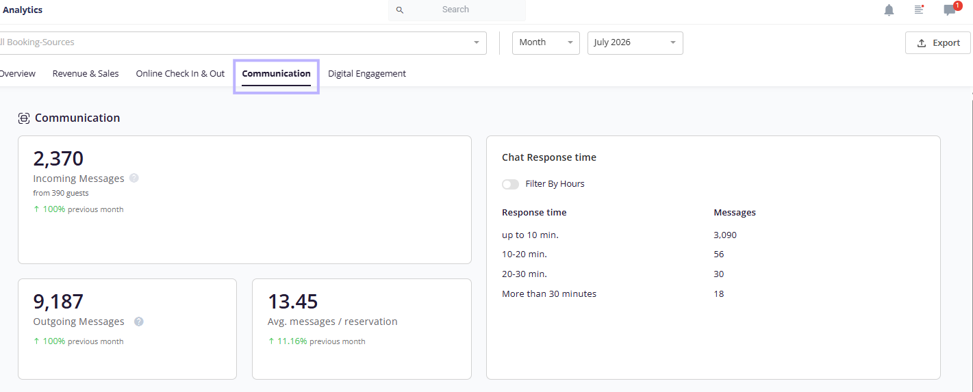
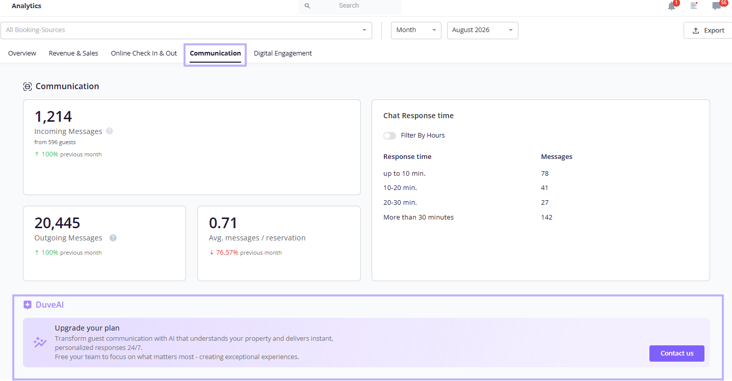
- Communication: a Communications section (dashboard component contains Incoming messages, outgoing messages, average messages per reservation, and response time),
-
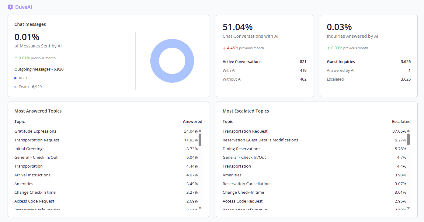
DuveAI section (dashboard component contains chat messages, inquiries answered by AI, chat conversations with AI, most answered topics, and most escalated topics),
-
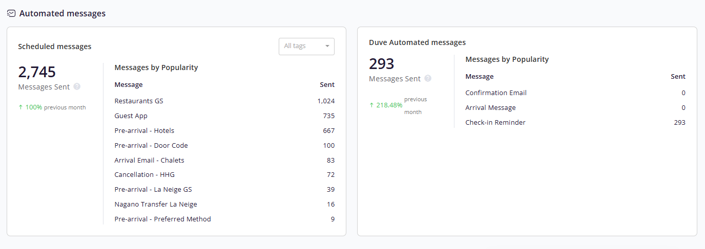
And an Automated messages section covering both Scheduled messages (messages sent, message counts by popularity, and a tags filter) and Duve automated messages (messages sent and message counts)
-
Filter communication data by hours (optional)
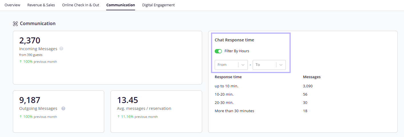
On the Communication dashboard component, turn on the Filter by hours switch. From and To dropdowns appear so you can limit the data to specific hours of the day.
-
Filter communication data by hours (optional)
Troubleshooting note: Accounts that do not have the DuveAI add-on in their account will see an "Upgrade your plan" banner:
-
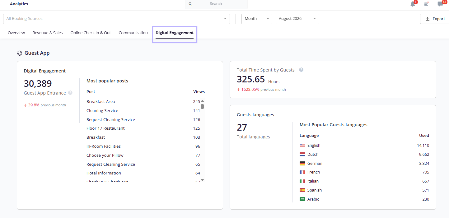
Digital Engagement:
- Guest-App section (dashboard component contains Guest app entrance total and popular posts list, total time spent by guests, total languages, and most popular guest languages)
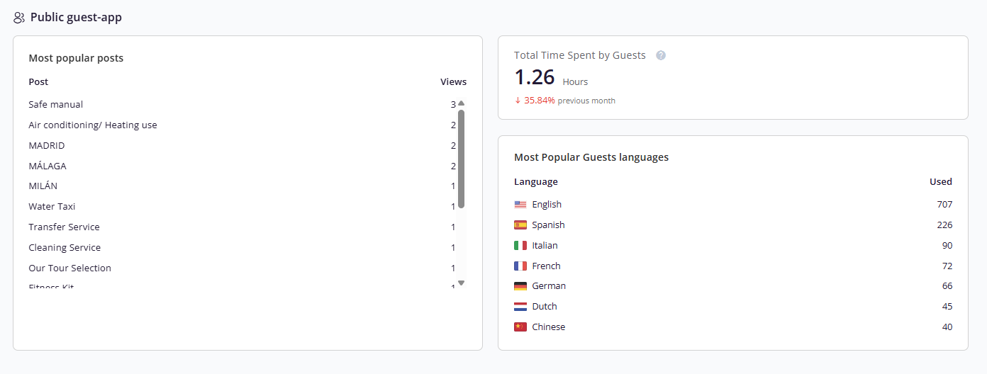
- A Public Guest-App section (most popular posts, total time spent by guests, and most popular guest languages)
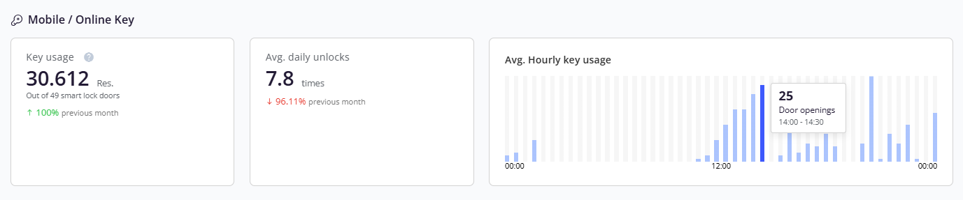
- A Mobile/Online key section (key usage, average daily unlocks, and hourly door openings)
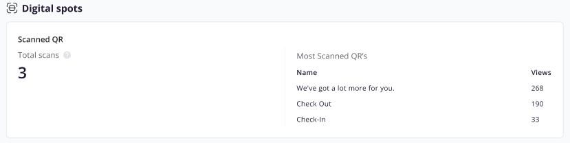
- And a Digital spots section (total scans and most scanned QRs)
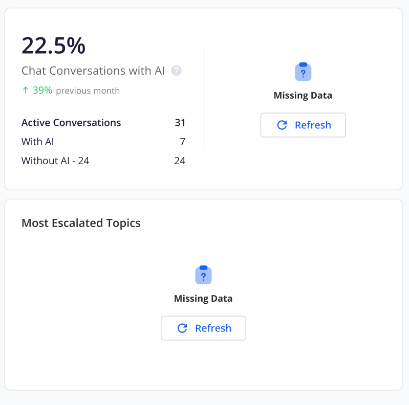
Missing Data
- If the data on a card fails to load, the card displays a Refresh button.
- Click Refresh, and the system tries to reload the data.
Troubleshooting
- The page seems stuck while loading: the full-page loader progresses based on the number of elements on the Overview screen, so it can take a few moments for data-heavy accounts. If it does not complete, refresh the page and check your network connection.
- The DuveAI section shows a banner instead of data: DuveAI is not active for your brand or account.
- The Mobile/Online key section is missing: The section is hidden automatically when the account has no key connections.
- A metric shows no data: Confirm your selected period. Every KPI is calculated for the period you selected, so a period with no activity returns no values.
- You cannot see the Analytics page or a tab: Your role may not have analytics permission. Contact your accounts admin.
- A card failed to load its data: The card displays a Refresh button. Click it, and the system tries to reload the data.
Restrictions & Limitations
- Fixed chart buckets: 5 bars when a month is selected, and 3 bars when a date range is selected
- The More info link is available only from the Overview tab
- The full-page loader appears only for the default Overview tab. Other tabs use skeleton loaders.
- Sections are conditional on product availability. No DuveAI toggle means a banner instead of AI metrics, and no key connections means the Mobile/Online key section is hidden entirely.
Tips & Tricks
- Hover a KPI tooltip when you are unsure what is included in a number.
- Watch the change indicators first. They tell you direction at a glance, before you read absolute values.
- Use Filter by hours on Communication to separate business-hours performance from overnight coverage.
FAQs
Q: Which tab do I land on when I open Analytics?
A: The Overview tab is selected by default and displays the consolidated dashboard state.
Q: A metric I used to rely on seems to be gone. Was it removed?
A: Most likely it was renamed or moved into a new section rather than removed.
Q: How many bars does the Revenue over time chart show?
A: Five bars when you select a specific month (the selected month plus the previous four), and three bars when you select a date range (the selected range plus the two preceding ranges of equal length).
Q: What does the More info link do, and why do I not always see it?
A: It navigates you from an Overview card to that card's dedicated tab. It is hidden when the card is already displayed inside its own tab.
Q: Why do I see a banner in the DuveAI section?
A: The banner appears when the DuveAI add-on is not enabled for your brand or account.
Q: Why is the Mobile/Online key section not showing?
A: It is hidden when your account has no key connections.
Q: Can I limit communication metrics to certain hours of the day?
A: Yes. Turn on the Filter by hours switch on the Communication dashboard component, then set the From and To hours.
Comments
0 comments
Article is closed for comments.