
Quick navigation:
- Who this is for
- Use cases
- Before you start
- How to set it up
- Host experience + Guest experience
- Desktop layout
- Restrictions & Limitations
- Tips & Tricks
- FAQs
- Related articles
Who this is forHosts and account admins who build and style the Guest app. You need access to the Guest App Builder (the "View Guidebook" user permission).
|
Use cases
- Match your hotel's brand: Set your cover photos, colors, logo, and fonts so the Guest app feels like part of your own website.
- Make the home page modern and inviting: Use the Overlay or Floating hero styles to create a strong first impression when guests open the app.
- Give guests quick access to what matters: Add shortcuts for Wi-Fi, access codes, a key post, or a popular upsell.
- Personalize the welcome: Customize the greeting guests see when they open the app, with dynamic guest details or seasonal messages.
- Highlight important content: Give a specific post a background color so it stands out from the rest of the home page.
- Welcome guests on any screen: Give guests who browse on a laptop or desktop a full-width layout with a top navigation bar, instead of a stretched phone layout.
Before you start
- Styles apply only to the Guest app. The branding of your emails (such as pre-check-in, confirmation, and pre-check-out emails) is set separately on the account's Branding page.
- Upload at least one cover photo. Hero styles other than Classic are built around your cover photo. If no cover photo is uploaded, the Guest app shows the Classic style.
- Set your Primary Buttons color early. The UI style samples and the background color checks both use it.
- Finalize your styles before you publish the Guest app to guests.
How to set it up
Open the Styles page and select a brand
-
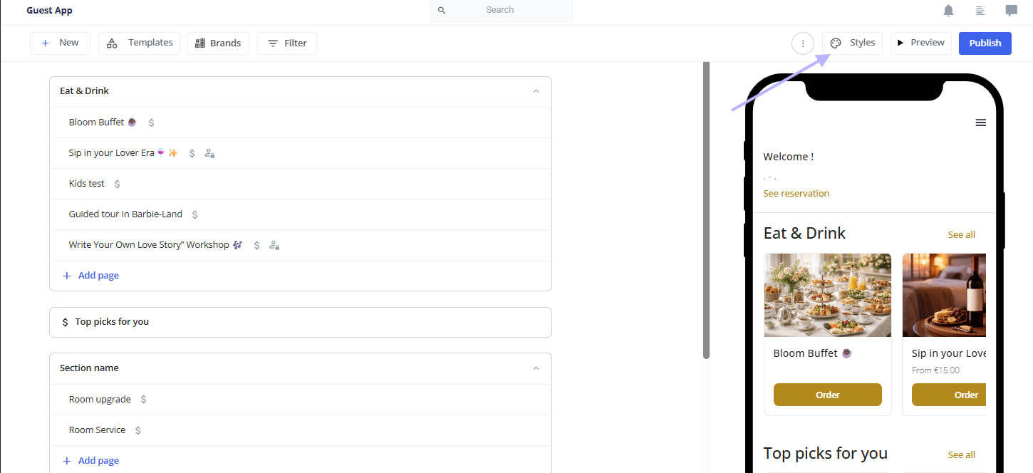
Go to the Guest App Builder and click Styles
-
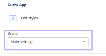
Under Brand, select the property or brand you want to style. You can customize each brand with its own cover photos, colors, and images.
Photos and hero section style
-
In the Photos section, upload your cover photos. Add several photos to show them in a carousel, and drag and drop them to change the order.
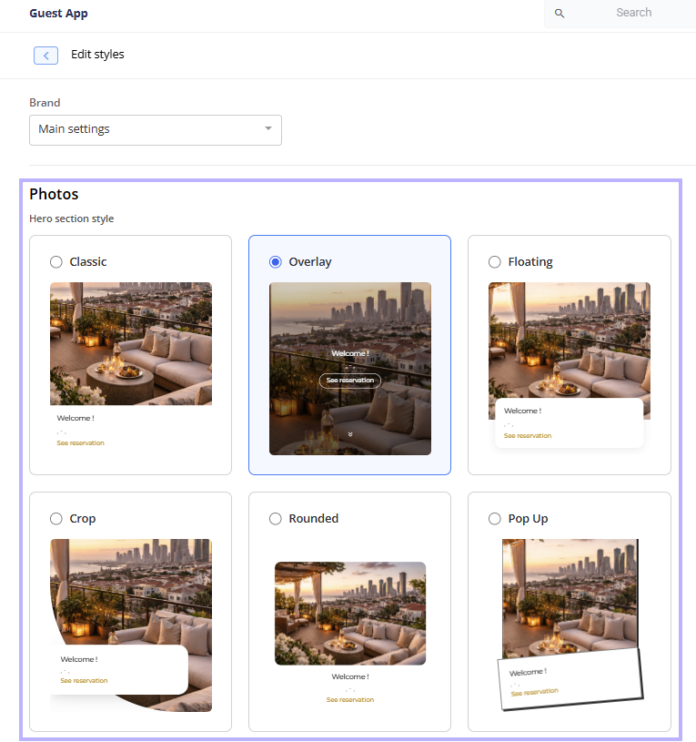
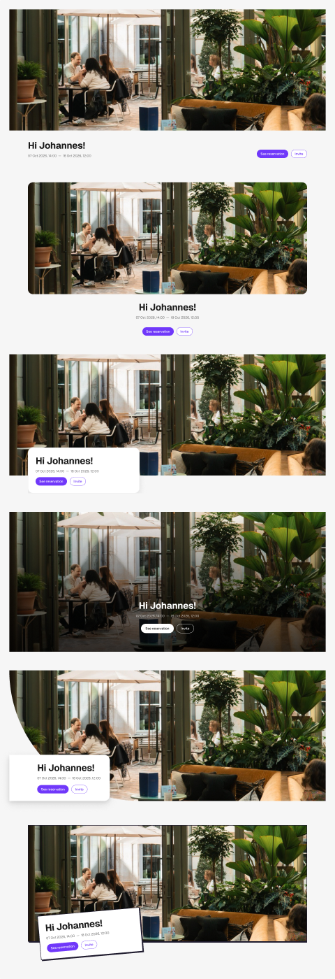
- Under Hero section style, select one of the six tiles. Each tile shows a live preview using your first cover photo:
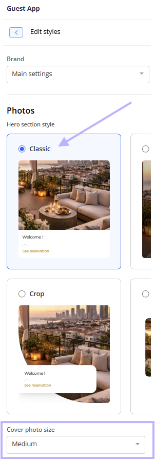
- Classic (default): The photo sits on top, with the welcome details below it.
- Overlay: The photo fills the screen down to the fold, with the welcome text on top of it. A double arrow lets guests scroll past the hero.
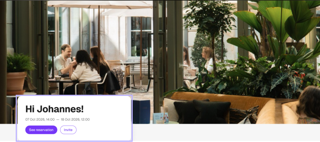
- Floating: The welcome card floats over the bottom of the photo.
- Crop: The photo has a curved crop, with the welcome card overlapping it.
- Rounded: The photo has rounded corners, with the welcome details centered below it.
- Pop Up: The welcome card is slightly tilted over the bottom of the photo.
-
Use Cover photo size to adjust the size of the cover photo. With Guest App Modernization, this field appears only when Classic is selected.
- Click Save.
Branding
- In Styles, go to the Branding section.
- Set each color by clicking the field and picking a color:
- Primary Buttons color: Your brand color. It's used for primary buttons and other brand-colored elements in the Guest app. Button text is white, so choose a color that's dark enough for white text to be readable. If it isn't, the color isn't applied, and an error appears under the field.
-
General background color: The background color for all pages in the Guest app. The default is white
#FFFFFF). Hover over the question mark next to the field name to see where it applies. -
Header & Footer background color: The background color of the bar at the top of the Guest app (with your logo and menu) and of the footer. The default is white (
#FFFFFF).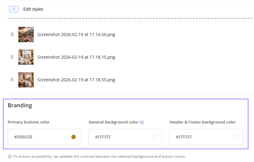
- Click Save.
- The side menu
- The home page background and the welcome card
- Shortcut buttons and page menu lists
- Banners
- Widgets (Map, Top Picks, Room Upgrade) and section cards (upsells and posts), unless you set a different color for them
- The footer
- Sub-pages, such as info pages, product pages, orders, and payments
- The chat window
- Bottom sheets and popups, such as the chat menu, Wi-Fi, codes, and the language picker
Choose a UI style
- In Styles > Branding, find UI Style.
- Select one of the six styles. Each is shown as a sample button in your Primary Buttons color:
- Rounded (default)
- Pill
- Square
- Soft shadow
- Hard shadow
- Outlined (a hand-drawn, sketched look)
- Click Save.

Secondary buttons color
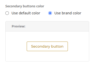
- In Styles > Branding, find Secondary buttons color.
- Select one of the options:
- Use default color: Uses Duve's default secondary button color.
- Use brand color: Applies your Primary Buttons color to secondary buttons.
-
Check the Preview box, which shows the secondary button in your selected color and UI style.
- Click Save.
Logo
- In Styles, under Logo, click Upload logo image and select your file.
- To replace it later, click the three dots on the logo and select Change.
-
Click Save.
Fonts
- In Styles, go to the Fonts section.
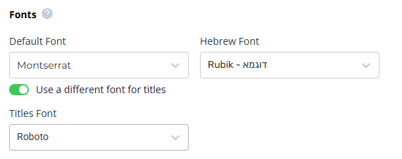
- Open the Default Font dropdown and choose a font. The list includes:
- Default fonts: Pre-selected fonts optimized for readability and performance.
- Custom fonts: Brand fonts uploaded to your account.
- Israeli accounts also see a Hebrew Font field for Hebrew text.
- (New) To use another font for titles, turn on Use a different font for titles and pick a font from the Titles Font dropdown. It uses the same font list as Default Font.
- Click Save.
- Section titles on the home page (list sections, carousel sections, and the Map widget)
- Headings created with the editor's heading 1 button in posts
Shortcuts
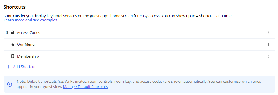
- In Styles, scroll to Shortcuts and click Add Shortcut.
- In the editor that opens, set:
- Icon (required): Choose an icon from the Duve icon library.
- Name (required): Up to 20 characters. Guests see this name.
-
Action Type (required): Choose one:
- URL: Link to an external page. You can turn on Open in new tab.
- Guest Info: Show information, such as access codes, in a bottom sheet.
- Post: Connect an existing post. The shortcut follows the post's display rules.
- Upsell: Connect an existing upsell. The shortcut follows the upsell's display rules.
- Conditions: Control when and to whom the shortcut is shown.
- Save the shortcut.
- In Styles, scroll to Shortcuts and click Manage Default Shortcuts.
- Customize the default shortcuts and save.
- Wi-Fi and Access Codes: Appear only after the codes are released.
- Room Key: Appears only if a third-party access code or mobile key provider is connected to Duve.
- Invite: Appears only when the reservation has at least 2 guests.
-
Room Control: Appears only for properties with room control set up in their account.
Advanced
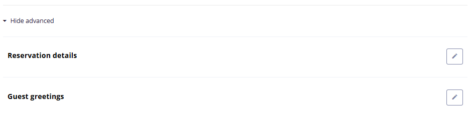
- In Styles, go to Advanced.
- In the dropdown, select the page guests should land on.
- Click Save.
- In Styles > Advanced, open Guest Greetings.
- Click Edit.
- Choose the language and enter your greeting.
-
Save your changes.
Host experience + Guest experience
- The hero section uses your selected style on both phones and desktop.
- The welcome card shows your custom greeting, and See Reservation opens the page you chose.
- Shortcuts appear on the home page, based on their conditions and the reservation.
- Buttons, cards, and popups follow your UI style and colors on every page.
Desktop layout
-
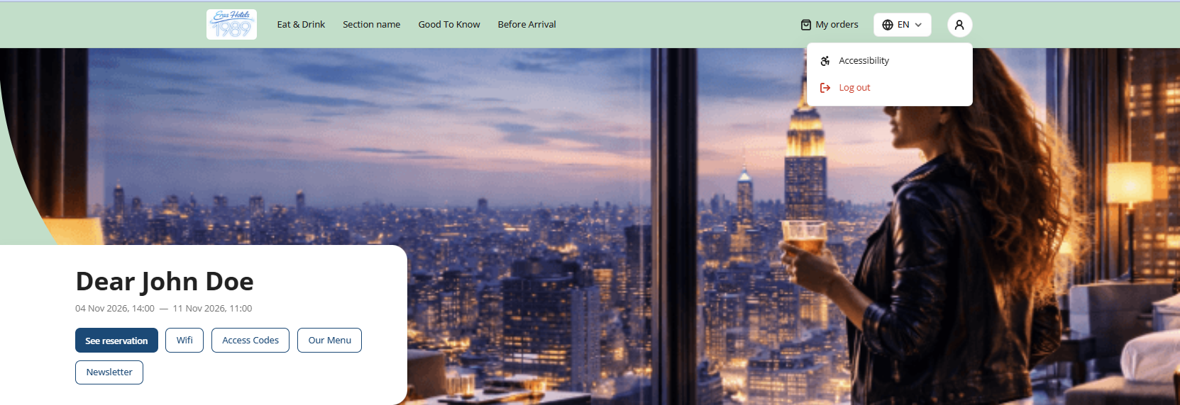
Header: A sticky header stays at the top of the page. From left to right, it shows:
- Your logo, which takes guests back to the home page
- Your Guest app sections, in the same order as the mobile menu. Clicking a section opens it, just like on mobile.
- A More menu with any sections that don't fit the width of the screen. It is hidden when all sections fit.
- My orders
- The language selector
-
The account menu, with Invite a friend, Accessibility, and Log out
-
Hero: Each of the six hero styles has its own desktop version, and guests see the style you selected.
-
Welcome card: Shows the guest greeting, the check-in and check-out dates and times, and the See reservation and Invite buttons. Where it appears depends on your hero style. For example, with Classic it sits below the photo, and with Floating it overlaps the bottom of the photo.
- Content: Sections below the welcome card appear in a centered container, so content stays easy to read on wide screens.
Restrictions & Limitations
- Background color contrast: If the color you pick would make your brand-colored buttons hard to see, or make dark text hard to read, the color isn't applied, and an "insufficient contrast" message appears. Choose a lighter color or adjust your Primary Buttons color.
- Shortcut names are limited to 20 characters.
- The desktop layout appears only at screen widths of 1024px and above. On smaller screens, such as tablets in portrait mode, guests see the mobile layout. If a guest resizes the browser window past 1024px, the layout switches right away without reloading.
- The desktop layout is shown only after a UI style has been saved in Styles > Branding. Until then, desktop guests see the previous layout.
- If your Guest app has no sections, the sections navigation is hidden from the desktop header.
Tips & Tricks
- Use a hex color code for precise brand color matching, and check that your colors follow your brand guidelines.
- If your titles font doesn't support Hebrew letters, Hebrew titles automatically use your Default Font.
- Turning off Use a different font for titles keeps your selected titles font saved. Turn the toggle back on to restore it.
- White is treated as "no color selected" for post backgrounds, so posts with white backgrounds follow the general background color.
- On the Floating and Pop Up hero styles, the photo counter moves to the top right so the welcome card doesn't cover it.
Comments
0 comments
Article is closed for comments.