
Make your Guest App your own with 6 hero styles, 6 UI styles, an app-wide background color, and a separate title font. Add content easily with new Text and Image elements directly on your home page.
New styles: a Guest App that matches your brand
Four new controls on the Styles screen change the whole look of your app. Every change shows instantly in the phone preview.
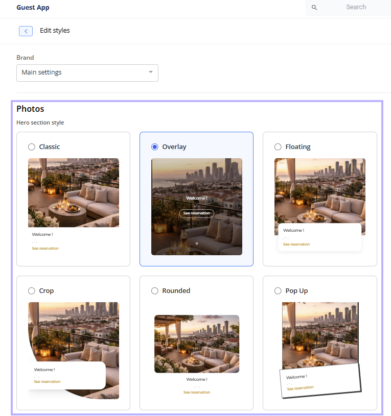
Hero section style
In the Photos section, use the new Hero section style picker to set how the cover photo and welcome card appear at the top of the home page. You can choose one of 6 styles:
- Classic (default): photo on top, welcome details below it
- Overlay: full-height photo with the welcome text on top of it
- Floating: a welcome card that floats over the bottom of the photo
- Crop: photo with a curved crop and an overlapping welcome card
- Rounded: inset photo with rounded corners
- Pop Up: a tilted, bold-outlined welcome card over the photo
The Cover photo size setting is available only with Classic. It is hidden when you select any other style.
UI Style
In the Branding section, use the new UI Style picker to set the shape and feel of buttons, cards, images, videos, accordions, upsell cards, and the map. You can choose from 6 styles: Pill, Rounded, Square, Soft shadow, Hard shadow, and Outlined. The samples render in your Primary Buttons color.
The default is Rounded, and existing apps are updated to the Rounded style.

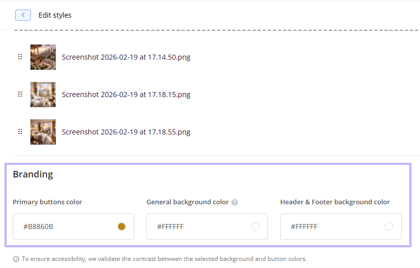
General background color
Use the new General background color picker (default white, #FFFFFF) to set one background across your entire Guest app: the home page, welcome card, shortcut buttons, side menu, banners, footer, sub-pages (info, product, orders, payments), the chat window, and popups such as Wi-Fi, codes, and the language picker. Widgets and section cards follow it unless overridden.
A different font for titles
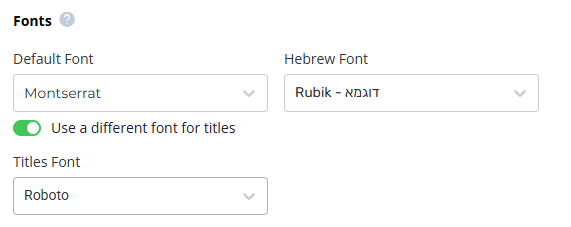
Under Fonts, turn on Use a different font for titles and pick a Titles Font from the same list as the Default Font. The titles font applies to section titles and to H1 headings in posts and Text elements. Turn it off and your titles go back to the Default Font.
New home-page elements: Text and Image
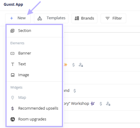
You no longer need a full post to add a line of text or a picture to the home page. The Builder's + New menu now groups items into Sections, Elements (Banner, plus the new Text and Image), and Widgets (Map, Recommended upsells).
Text
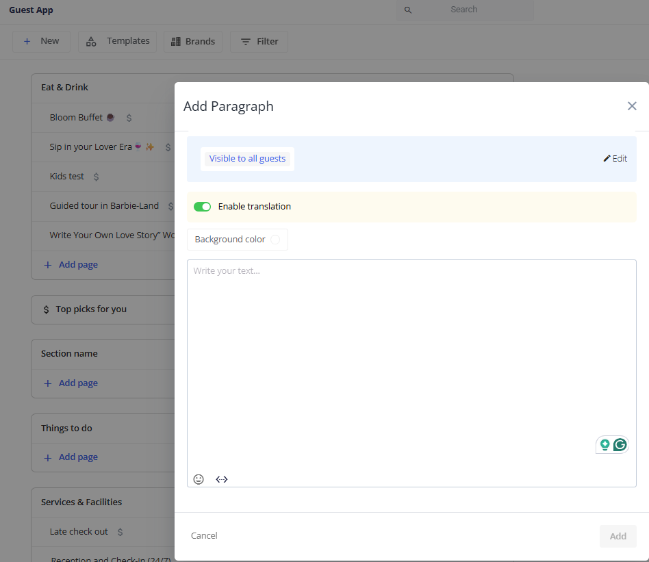
- Click Text to open the Add Paragraph dialog, a rich-text editor with emoji, dynamic fields, bold, italic, H1, H2, lists, and links.
- Supports translation and the same display conditions as posts.
- Shows directly on the home page, with no post tile and no click-through, on your General background color.
Image
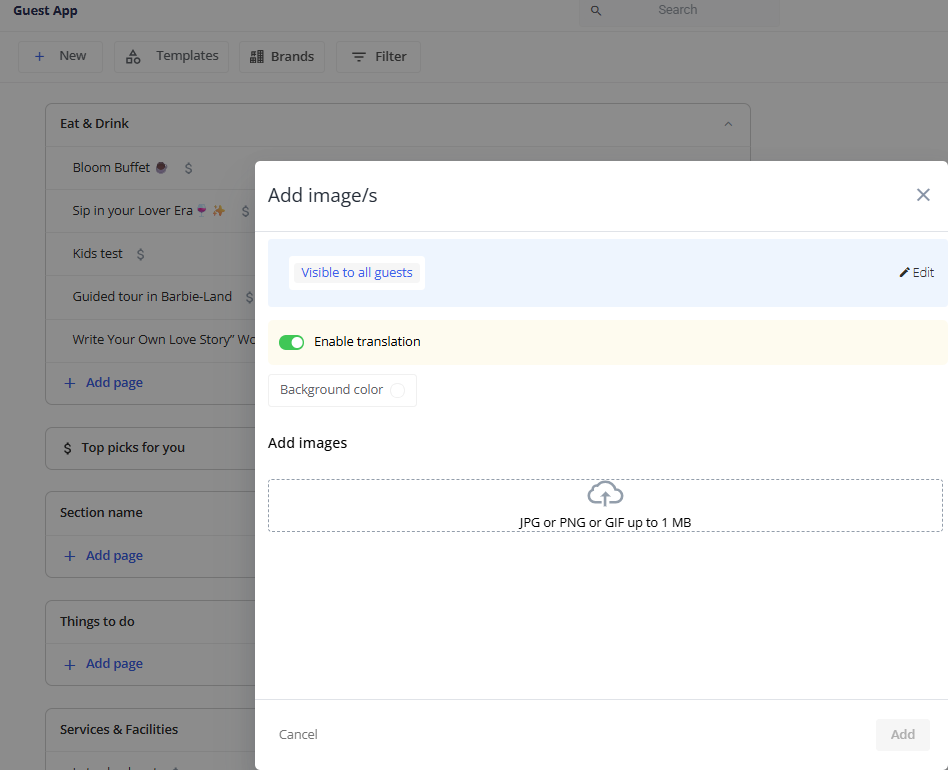
- Click Image to open the Add image/s dialog and upload one or more images (same formats and size limits as post images).
- Supports translation, custom fields, and the same display conditions as posts.
- Shows on the home page as a standalone image or gallery.
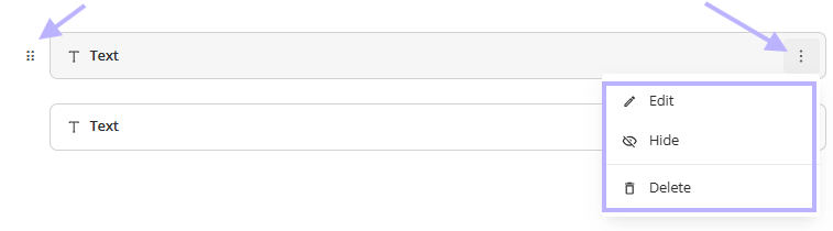
Both elements appear as their own cards in the Builder. You can drag them to reorder, and use the card menu to Edit, Hide, or Delete them.
Restrictions & Limitations
- Text and Image can be added only at the home-page level, not inside sections.
- The elements themselves are not clickable. Links work only inside the text.
A tidier Builder: collapsible section cards
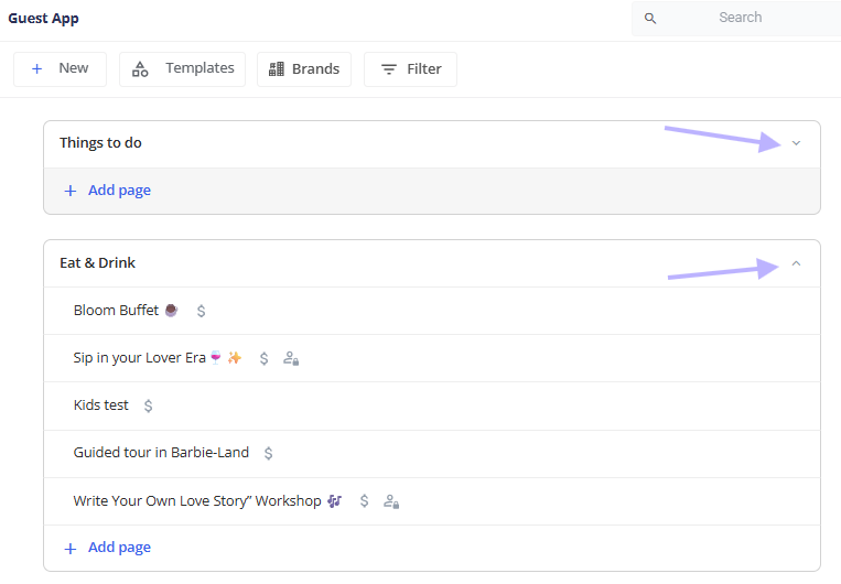
Sections on the Builder screen now use a new card design, so large apps are easier to navigate. Each card shows a color indicator on its left edge, the section title, its list of pages, an Add page link, and a chevron to collapse or expand it.
- All sections are expanded on first load. Collapse any of them with the chevron.
- Your collapse state is kept when you return to the Builder.
- When you drag a page onto a collapsed card, it expands while you hold the item.
- Widget sections such as Room Upgrades and Map use the same card design.
Comments
0 comments
Article is closed for comments.